12 Multilevel PSA
12.1 Introduction
Given the large amount of data to be summarized, the use of graphics are an integral component of representing the results. Pruzek and Helmreich (2009) introduced a class of graphics for visualizing dependent sample tests (see also Pruzek & Helmreich, 2010; Danielak, Pruzek, Doane, Helmreich, & Bryer, 2011). This framework was then extended for propensity score methods using stratification (Helmreich & Pruzek, 2009). In particular, the representation of confidence intervals relative to the unit line (i.e. the line y=x) provided a new way of determining whether there is a statistically significant difference between two groups. The multilevelPSA package provides a number of graphing functions that extend these frameworks for multilevel PSA. The figure below represents a multilevel PSA assessment plot with annotations. This graphic represents the results of comparing private and public schools in North America using the Programme of International Student Assessment (PISA; Organisation for Economic Co-Operation and Development, 2009). The PISA data to create this graphic are included in the multilevelPSA package and a more detailed description of how to create this graphic are discussed in the next section. Additionally, the use of PISA makes more visible certain features of the graphics used. As discussed in chapters four and five, the differences between charter and traditional public schools is minimal and therefore some features of the figures are less apparent. The following section focuses on the features of this graphic.
In the figure below, the x-axis corresponds to math scores for private schools and the y-axis corresponds to public school maths cores. Each colored circle (a) is a country with its size corresponding to the number of students sampled within each country. Each country is projected to the lower left, parallel to the unit line, such that a tick mark is placed on the line with slope -1 (b). These tick marks represent the distribution of differences between private and public schools across countries. Differences are aggregated (and weighted by size) across countries. For math, the overall adjusted mean for private schools is 487, and the overall adjusted mean for public schools is 459 and represented by the horizontal (c) and vertical (d) blue lines, respectively. The dashed blue line parallel to the unit line (e) corresponds to the overall adjusted mean difference and likewise, the dashed green lines (f) correspond to the confidence interval. Lastly, rug plots along the right and top edges of the graphic (g) correspond to the distribution of each country’s overall mean private and public school math scores, respectively.
The figure represents a large amount of data and provides insight into the data and results. The figure provides overall results that would be present in a traditional table, for instance the fact that the green dashed lines do not span the unit line (i.e. y = x) indicates that there is a statistically significant difference between the two groups. However additional information is difficult to convey in tabular format. For example, the rug plots indicate that the spread in the performance of both private and public schools across countries is large. Also observe that Canada, which has the largest PISA scores for both groups, also has the largest difference (in favor of private schools) as represented by the larger distance from the unit line.
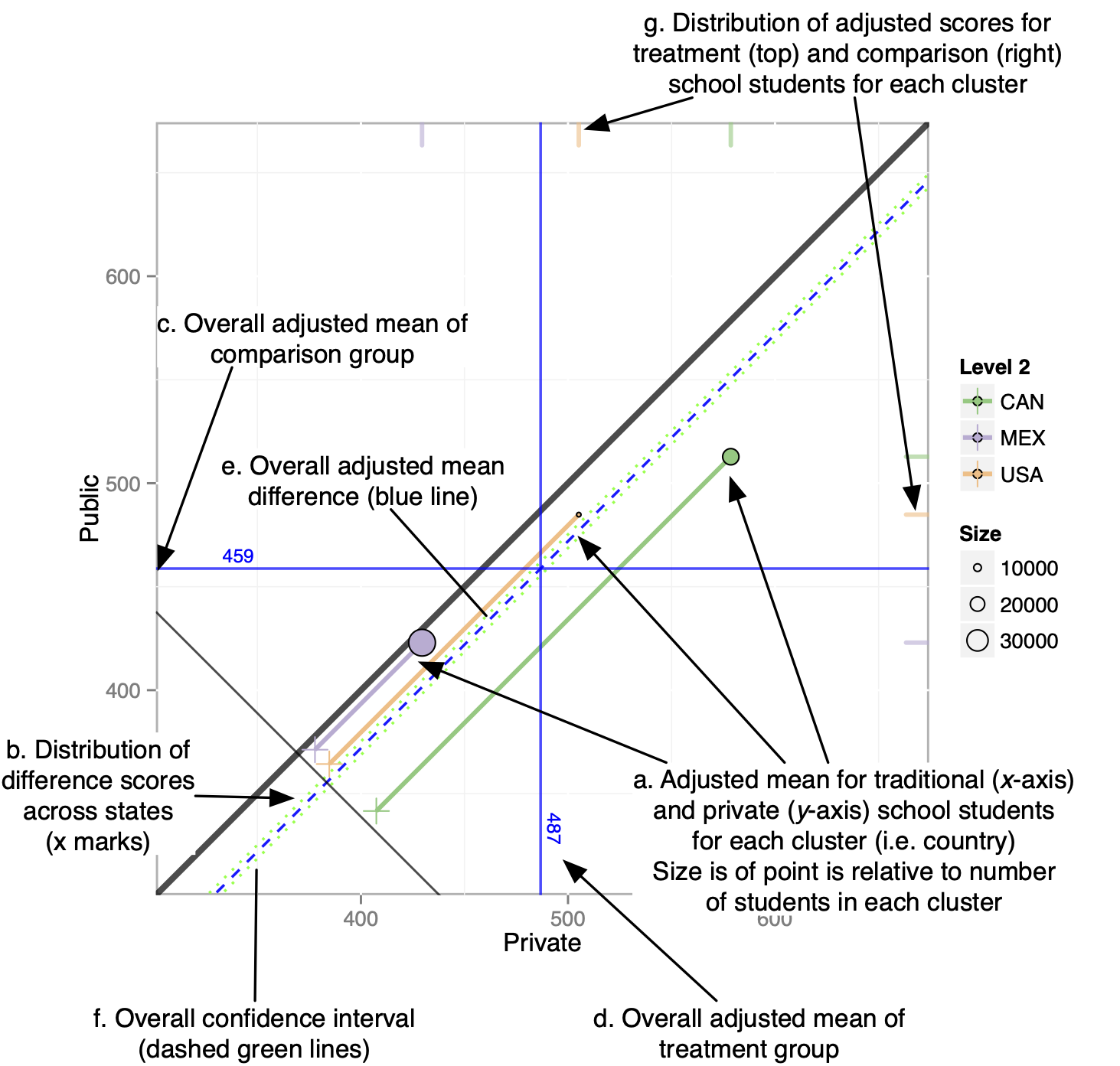
Figure 12.1: Annotated multilevel PSA assessment plot. This plot compares private schools (x- axis) against public schools (y-axis) for North America from the Programme of International Student Assessment.
12.2 Working Example
The multilevelPSA package includes North American data from the Programme of International Student Assessment (PISA; Organisation for Economic Co-Operation and Development, 2009). This data is made freely available for research and is utilized here so that the R code is reproducible9. This example compares the performance of private and public schools clustered by country. Note that PISA provide five plausible values for the academic scores since students complete a subset of the total assessment. For simplicity, the math score used for analysis is the average of these five plausible scores.
data(pisana)
data(pisa.psa.cols)
pisana$MathScore <- apply(pisana[,paste0('PV', 1:5, 'MATH')], 1, sum) / 5
The mlpsa.ctree function performs phase I of the propensity score analysis using classification trees, specifically using the ctree function in the party package. The getStrata function returns a data frame with a number of rows equivalent to the original data frame indicating the stratum for each student.
mlpsa <- mlpsa.ctree(pisana[,c('CNT', 'PUBPRIV', pisa.psa.cols)],
                     formula = PUBPRIV ~ .,
                     level2 = 'CNT')
mlpsa.df <- getStrata(mlpsa, pisana, level2 = 'CNT')
Similarly, the mlpsa.logistic estimates propensity scores using logistic regression. The getPropensityScores function returns a data frame with a number of rows equivalent to the original data frame.
mlpsa.lr <- mlpsa.logistic(pisana[,c('CNT', 'PUBPRIV', pisa.psa.cols)],
                           formula = PUBPRIV ~ .,
                           level2 = 'CNT')
mlpsa.lr.df <- getPropensityScores(mlpsa.lr, nStrata = 5)
head(mlpsa.lr.df)## level2 ps strata
## 1 CAN 0.9171885 2
## 2 CAN 0.9410543 3
## 3 CAN 0.9694831 4
## 4 CAN 0.9300448 2
## 5 CAN 0.8362229 1
## 6 CAN 0.9734376 4The covariate.balance function calculates balance statistics for each covariate by estimating the effect of each covariate before and after adjustment. The results can be converted to a data frame to view numeric results or the plot function provides a balance plot. This figure depicts the effect size of each covariate before (blue triangle) and after (red circle) propensity score adjustment. As shown here, the effect size for nearly all covariates is smaller than the unadjusted effect size. The few exceptions are for covariates where the unadjusted effect size was already small. There is no established threshold for what is considered a sufficiently small effect size. In general, I recommend adjusted effect sizes less than 0.1 which reflect less than 1% of variance explained.
cv.bal <- covariate.balance(covariates = pisana[,pisa.psa.cols],
                            treatment = pisana$PUBPRIV,
                            level2 = pisana$CNT,
                            strata = mlpsa.df$strata)
head(as.data.frame(cv.bal))
## covariate es.adj es.adj.wtd es.unadj
## 1 (Intercept) 0.00000000 0.000000e+00 NaN
## 2 ST05Q01Yes, more than one year 0.09720705 2.335610e-04 0.28695986
## 3 ST05Q01Yes, one year or less 0.05131164 6.622276e-05 0.22032056
## 4 ST07Q01Yes, once 0.10349619 -1.123270e-03 0.23453956
## 5 ST07Q01Yes, twice or more 0.04447145 -3.720711e-04 0.08655983
## 6 ST10Q01<ISCED level 2> 0.02969316 -1.733254e-04 0.17085288
plot(cv.bal)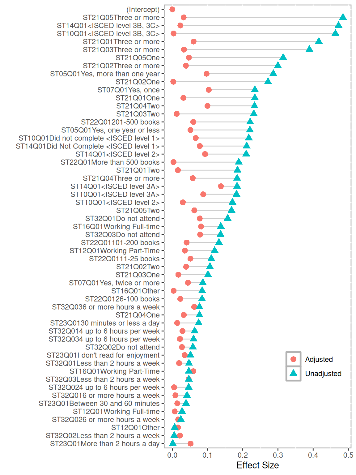
Figure 12.2: Multilevel PSA balance plot for PISA. The effect sizes (standardized mean differences) for each covariate are provided before PSA adjustment (blue triangles) and after PSA adjustment (red circles).
The mlpsa function performs phase II of propensity score analysis and requires four parameters: the response variable, treatment indicator, stratum, and clustering indicator. The minN parameter (which defaults to five) indicates what the minimum stratum size is to be included in the analysis. For this example, 463, or less than one percent of students were removed because the stratum (or leaf node for classification trees) did not contain at least five students from both the treatment and control groups.
results.psa.math <- mlpsa(response = mlpsa.df$MathScore,
                          treatment = mlpsa.df$PUBPRIV,
                          strata = mlpsa.df$strata,
                          level2 = mlpsa.df$CNT)
The summary function provides the overall treatment estimates as well as level one and two summaries.
summary(results.psa.math)## level2 strata Treat Treat.n Control Control.n ci.min ci.max
## 1 CAN Overall 38.82989 1625 626.72066 21093 581.6370 594.1446
## 2 <NA> 1 14.50000 28 531.84840 1128 NA NA
## 3 <NA> 2 5.00000 9 616.31146 1326 NA NA
## 4 <NA> 3 6.00000 11 296.99683 630 NA NA
## 5 <NA> 4 69.96429 140 982.43080 2240 NA NA
## 6 <NA> 5 4.50000 8 89.64246 179 NA NA
## 7 <NA> 6 10.00000 19 151.75484 310 NA NA
## 8 <NA> 7 42.00000 83 1342.03571 3276 NA NA
## 9 <NA> 8 3.00000 5 60.50000 120 NA NA
## 10 <NA> 9 21.00000 41 94.14737 190 NA NA
## 11 <NA> 10 10.50000 20 46.00000 91 NA NA
## 12 <NA> 11 22.50000 44 360.42533 750 NA NA
## 13 <NA> 12 17.50000 34 144.37671 292 NA NA
## 14 <NA> 13 4.50000 8 232.05263 475 NA NA
## 15 <NA> 14 11.00000 21 75.70199 151 NA NA
## 16 <NA> 15 62.83333 126 943.64902 2134 NA NA
## 17 <NA> 16 13.00000 25 122.71837 245 NA NA
## 18 <NA> 17 25.00000 49 68.48905 137 NA NA
## 19 <NA> 18 29.00000 57 317.34901 659 NA NA
## 20 <NA> 19 56.88496 113 155.76730 318 NA NA
## 21 <NA> 20 8.00000 15 72.00000 143 NA NA
## 22 <NA> 21 23.50000 46 194.97236 398 NA NA
## 23 <NA> 22 49.26263 99 97.50000 194 NA NA
## 24 <NA> 23 20.50000 40 91.49727 183 NA NA
## 25 <NA> 24 25.90385 52 168.19591 342 NA NA
## 26 <NA> 25 51.29126 103 580.64643 1219 NA NA
## 27 <NA> 26 6.00000 11 57.00000 113 NA NA
## 28 <NA> 27 18.00000 35 384.02861 804 NA NA
## 29 <NA> 28 3.00000 5 8.00000 15 NA NA
## 30 <NA> 29 6.50000 12 169.93391 348 NA NA
## 31 <NA> 30 73.00000 145 562.38661 1195 NA NA
## 32 <NA> 31 73.74150 147 392.91241 822 NA NA
## 33 <NA> 32 14.00000 27 4.00000 7 NA NA
## 34 <NA> 33 24.00000 47 319.53111 659 NA NA
## 35 MEX Overall 57.81239 4044 683.78533 34090 622.4796 629.4663
## 36 <NA> 1 41.72289 83 7.00000 13 NA NA
## 37 <NA> 2 71.68966 145 44.38202 89 NA NA
## 38 <NA> 3 74.54305 151 88.87640 178 NA NA
## 39 <NA> 4 7.50000 14 75.83117 154 NA NA
## 40 <NA> 5 63.25984 127 225.50000 484 NA NA
## 41 <NA> 6 29.00000 58 298.53228 635 NA NA
## 42 <NA> 7 121.19433 247 140.26280 293 NA NA
## 43 <NA> 8 209.76334 431 397.31688 871 NA NA
## 44 <NA> 9 3.50000 6 55.50000 110 NA NA
## 45 <NA> 10 8.50000 16 59.59504 121 NA NA
## 46 <NA> 11 138.54737 285 328.04167 696 NA NA
## 47 <NA> 12 8.50000 16 56.17857 112 NA NA
## 48 <NA> 13 17.00000 33 434.16013 943 NA NA
## 49 <NA> 14 69.50000 138 649.05997 1484 NA NA
## 50 <NA> 15 49.54545 99 288.23102 619 NA NA
## 51 <NA> 16 38.83333 78 407.44543 898 NA NA
## 52 <NA> 17 17.50000 34 127.07252 262 NA NA
## 53 <NA> 18 57.00000 113 176.61580 367 NA NA
## 54 <NA> 19 27.00000 53 216.41850 454 NA NA
## 55 <NA> 20 34.31884 69 177.90736 367 NA NA
## 56 <NA> 21 37.36842 76 105.10138 217 NA NA
## 57 <NA> 22 46.54839 93 74.58000 150 NA NA
## 58 <NA> 23 91.76344 186 260.15539 547 NA NA
## 59 <NA> 24 5.50000 10 64.78462 130 NA NA
## 60 <NA> 25 39.17500 80 78.58491 159 NA NA
## 61 <NA> 26 81.43114 167 465.36442 1040 NA NA
## 62 <NA> 27 71.41096 146 525.40170 1175 NA NA
## 63 <NA> 28 23.00000 45 196.59852 406 NA NA
## 64 <NA> 29 40.50000 80 825.43454 1963 NA NA
## 65 <NA> 30 31.00000 61 366.45997 787 NA NA
## 66 <NA> 31 24.50000 48 299.31628 645 NA NA
## 67 <NA> 32 112.05195 231 1429.14418 4314 NA NA
## 68 <NA> 33 14.50000 28 135.84946 279 NA NA
## 69 <NA> 34 17.50000 34 451.56762 1013 NA NA
## 70 <NA> 35 32.00000 63 925.81218 2364 NA NA
## 71 <NA> 36 9.50000 18 115.25641 234 NA NA
## 72 <NA> 37 52.56075 107 1282.64124 3632 NA NA
## 73 <NA> 38 13.00000 25 956.40222 2434 NA NA
## 74 <NA> 39 8.00000 15 170.04971 342 NA NA
## 75 <NA> 40 4.00000 7 792.55896 1959 NA NA
## 76 <NA> 41 8.00000 15 440.16833 1004 NA NA
## 77 <NA> 42 152.62620 313 71.74658 146 NA NA
## 78 USA Overall 18.01128 345 379.63696 4888 349.9843 373.2671
## 79 <NA> 1 25.50000 50 569.57260 1219 NA NA
## 80 <NA> 2 8.50000 16 599.69690 1323 NA NA
## 81 <NA> 3 17.00000 34 224.27706 462 NA NA
## 82 <NA> 4 21.50000 42 130.95817 263 NA NA
## 83 <NA> 5 20.73810 42 162.84776 335 NA NA
## 84 <NA> 6 10.76190 21 254.84030 526 NA NA
## 85 <NA> 7 40.50000 80 136.61511 278 NA NA
## 86 <NA> 8 21.00000 41 101.38164 207 NA NA
## 87 <NA> 9 7.50000 14 126.93822 259 NA NA
## 88 <NA> 10 3.00000 5 8.50000 16 NA NAThe plot function creates the multilevel assessment plot. Here it is depicted with side panels showing the distribution of math scores for all strata for public school students to the left and private school students below. These panels can be plotted separately using the mlpsa.circ.plot and mlpsa.distribution.plot functions.
plot(results.psa.math)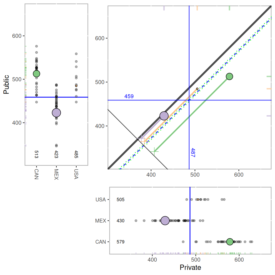
Figure 12.3: Multilevel PSA assessment plot for PISA. The main panel provides the adjusted mean for private (x-axis) and public (y-axis) for each country. The left and lower panels provide the mean for each stratum for the public and private students, respectively. The overall adjusted mean difference is represented by the dashed blue line and the 95% confidence interval by the dashed green lines. There is a statistically significant difference between private and public school student performance as evidenced by the confidence interval not spanning zero (i.e. not crossing the unit line y=x.
Lastly, the mlpsa.difference.plot function plots the overall differences. The sd parameter is optional, but if specified, the x-axis can be interpreted as standardized effect sizes.
mlpsa.difference.plot(results.psa.math,
                      sd = mean(mlpsa.df$MathScore, na.rm=TRUE))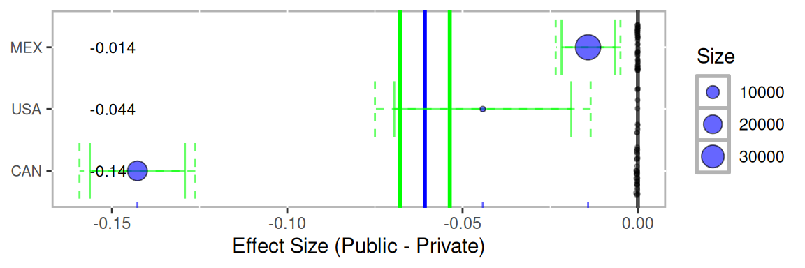
Figure 12.4: Multilevel PSA difference plot for PISA. Each blue dot corresponds to the effect size (standardized mean difference) for each country. The vertical blue line corresponds to the overall effect size for all countries. The green lines correspond to the 95% confidence intervals. The dashed green lines Bonferroni-Sidak (c.f. Abdi, 2007) adjusted confidence intervals. The size of each dot is proportional to the sample size within each country.