10 Effects of Tutoring on Course Grades
In the first example we will utilize observational data obtained to evaluate the effectiveness of tutoring services on course grades. Treatment students consisted of those students who used tutoring services while enrolled in a online writing course between 2008 and 2011. A comparison group was identified as students enrolled in a course section with a student who used tutoring services. The treatment group was then divided into two based upon the number of times they utilized tutoring services. “Novice” users are those who used the services once and “regular” users are those who used services two or more times. Covariates available for estimating propensity scores are gender, ethnicity, military status, English second language learner, educational level for mother and father, age at the beginning of the course, employment level at college enrollment, income level at college enrollment, number of transfer credits, and GPA at the start of the course.
names(tutoring)## [1] "treat" "Course" "Grade" "Gender" "Ethnicity"
## [6] "Military" "ESL" "EdMother" "EdFather" "Age"
## [11] "Employment" "Income" "Transfer" "GPA" "GradeCode"
## [16] "Level" "ID" "treat2"The courses represented here are structured such that the variation from section-to-section is minimal. However, the differences between courses is substantial and therefore we will utilize partial exact matching so that all matched students will have taken the same course.
table(tutoring$treat, tutoring$Course, useNA="ifany")##
## ENG*101 ENG*201 HSC*310
## Control 349 518 51
## Treat1 22 36 76
## Treat2 31 32 27The first step of analysis is to estimate the propensity scores. The trips function will estimate three propensity score models, \(PS_1\), \(PS_2\), and \(PS_3\) as described above. Note that when specifying the formula the dependent variable, or treatment indicator, is not included. The trips function will replace the dependent variable as it estimates the three logistic regression models.
formu <- ~ Gender + Ethnicity + Military + ESL + EdMother + EdFather +
Age + Employment + Income + Transfer + GPA
tutoring.tpsa <- trips(tutoring, tutoring$treat, formu)
Figure 10.1 is a triangle plot that depicts the propensity scores from the three models. Since each student has two propensity scores, their scores are connected with a line. The black line in Figure 10.1 represents one matched triplet estimated below.
plot(tutoring.tpsa)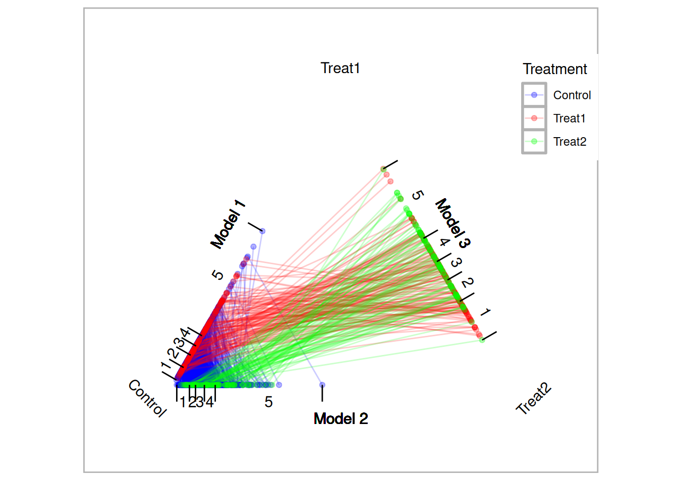
The default for trimatch is to use the maximumTreat method retaining each treatment unit once with treatment one units matched more than once only if the corresponding treatment two unit would not be matched otherwise.
tutoring.matched <- trimatch(tutoring.tpsa, exact=tutoring[,c("Course")])Setting the method parameter to NULL will result in caliper matching. All matched triplets within the specified caliper are retained. This will result in the largest number of matched triplets.
tutoring.matched.caliper <- trimatch(tutoring.tpsa,
exact=tutoring[,c("Course")], method=NULL)
Lastly, we will use the OneToN method to retain a 2-to-1-to-n and 3-to-2-n matches.
tutoring.matched.2to1 <- trimatch(tutoring.tpsa,
exact=tutoring[,c("Course")], method=OneToN, M1=2, M2=1)
tutoring.matched.3to2 <- trimatch(tutoring.tpsa,
exact=tutoring[,c("Course")],
method=OneToN, M1=3, M2=2)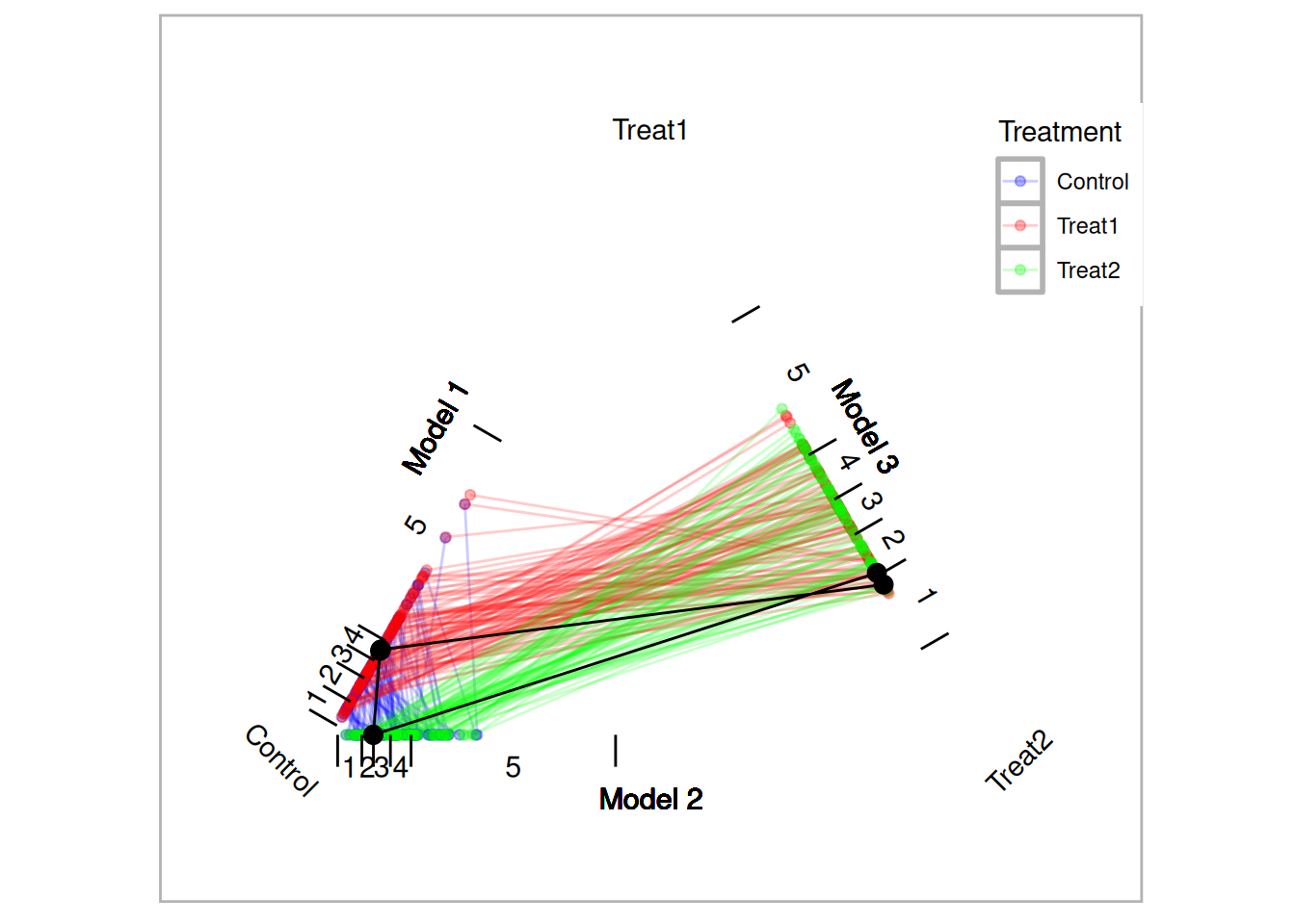
Figure 10.1: Traingle Plot
10.1 Examining Unmatched Students
The different methods for retaining matched triplets address the issue of overrepresentation of treatment units. In this example there four times as many control units as treatment units (the ratio is larger when considering the treatments separately). These methods fall on a spectrum where each treatment unit is used minimally (maximumTreat method) or all units are used (caliper matching). (Rosenbaum 2012) suggests testing hypothesis more than once and it is our general recommendation to utilize multiple methods. Functions to help present and compare the results from multiple methods are provided and discussed below.
The unmatched function will return the rows of students who were not matched. The summary function will provide information about how many students within each group were not matched. As shown below, the caliper matching will match the most students. In this particular example, in fact, the only substantial difference in the unmatched students is with the control group. All methods fail to match 37 treatment one students. This is due to the fact that there is not another student within the specified caliper that match exactly on the course.
summary(unmatched(tutoring.matched))## 892 (78.1%) of 1142 total data points were not matched.
## Unmatched by treatment:
## Control Treat1 Treat2
## 834 (90.8%) 39 (29.1%) 19 (21.1%)
summary(unmatched(tutoring.matched.caliper))## 638 (55.9%) of 1142 total data points were not matched.
## Unmatched by treatment:
## Control Treat1 Treat2
## 580 (63.2%) 39 (29.1%) 19 (21.1%)
summary(unmatched(tutoring.matched.2to1))## 1000 (87.6%) of 1142 total data points were not matched.
## Unmatched by treatment:
## Control Treat1 Treat2
## 870 (94.8%) 97 (72.4%) 33 (36.7%)
summary(unmatched(tutoring.matched.3to2))## 928 (81.3%) of 1142 total data points were not matched.
## Unmatched by treatment:
## Control Treat1 Treat2
## 831 (90.5%) 75 (56%) 22 (24.4%)10.2 Checking Balance
The eventual strength of propensity score methods is dependent on how well balance is achieved. (J. E. Helmreich and Pruzek 2009) introduced graphical approaches to evaluating balance. We provide functions that extend that framework to matching of three groups. Figure 10.2 is a multiple covariate balance plot that plots the absolute effect size of each covariate before and after adjustment. In this example, the figure suggests that reasonable balance has been achieved across all covariates and across all three models since effect sizes are smaller than the unadjusted in most cases and relatively small.
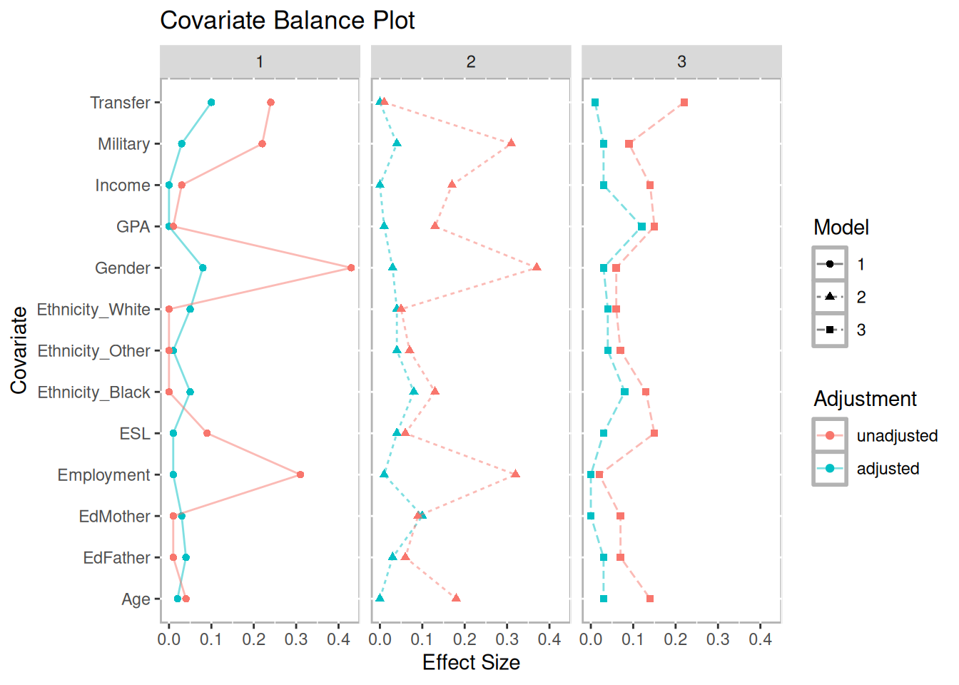
Figure 10.2: Multiple Covariate Balance Plot of Absolute Standardized Effect Sizes Before and After Propensity Score Adjustment
Figure 10.3 is the results of the balance.plot function. This function will provide a bar chart for categorical covariates and box plots for quantitative covariates, individually or in a grid.
bplots <- balance.plot(tutoring.matched, tutoring[,all.vars(formu)],
        legend.position="none", x.axis.labels=c("C","T1","T1"), x.axis.angle=0)
print(plot(bplots, cols=3, byrow=FALSE))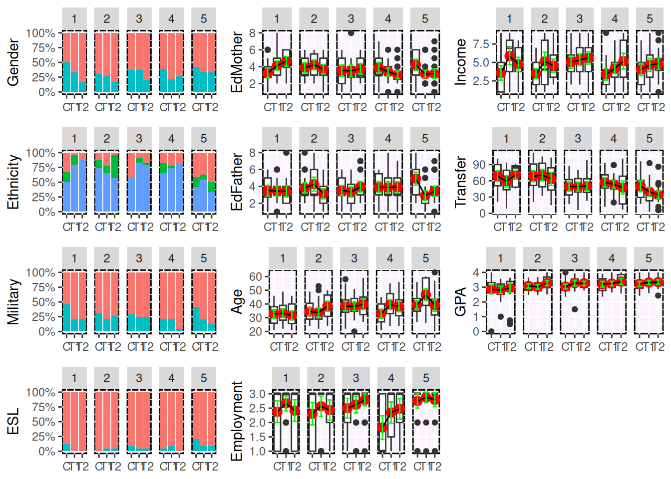
Figure 10.3: Covariate Balance Plots
## NULL10.3 Phase II: Estimating Effects of Tutoring on Course Grades
In phase two of propensity score analysis we wish to compare our outcome of interest, course grade in this example, across the matches. A custom merge function is provided to merge an outcome from the original data frame to the results of trimatch. This merge function will add three columns with the outcome for each of the three groups.
##  [1] "Treat1"      "Treat2"      "Control"     "D.m3"        "D.m2"
##  [6] "D.m1"        "Dtotal"      "Treat1.out"  "Treat2.out"  "Control.out"
head(matched.out)## Treat1 Treat2 Control D.m3 D.m2 D.m1 Dtotal
## 1 368 39 331 0.007053754 0.001788577 1.039322e-02 0.01923555
## 2 158 279 365 0.003373585 0.009530680 1.071188e-02 0.02361614
## 3 899 209 100 0.001929173 0.013633300 9.183572e-03 0.02474604
## 4 692 596 1055 0.023785086 0.010292177 1.862058e-03 0.03593932
## 5 616 209 208 0.020203398 0.016562521 3.168865e-05 0.03679761
## 6 28 852 154 0.007501996 0.014214100 1.776640e-02 0.03948249
## Treat1.out Treat2.out Control.out
## 1 4 4 0
## 2 4 4 4
## 3 4 3 4
## 4 4 3 4
## 5 4 3 0
## 6 4 4 2Although the merge function is convenient for conducting your own analysis, the summary function will perform the most common analyses including Friedman Rank Sum test and repeated measures ANOVA. If either of those tests produce a p value less than the specified threshold (0.05 by default), then the summary function will also perform and return Wilcoxon signed rank test and three separate dependent sample t-tests see (Austin 2010) for discussion of dependent versus independent t-tests.
## [1] "PercentMatched"       "friedman.test"        "rmanova"
## [4] "pairwise.wilcox.test" "t.tests"
s1$friedman.test##
## Friedman rank sum test
##
## data: Outcome and Treatment and ID
## Friedman chi-squared = 27.904, df = 2, p-value = 8.726e-07
s1$t.tests## Treatments t df p.value sig mean.diff ci.min
## 1 Treat1.out-Treat2.out -2.791302 117 6.132601e-03 ** -0.3220339 -0.5505191
## 2 Treat1.out-Control.out 3.817862 117 2.168534e-04 *** 0.7033898 0.3385190
## 3 Treat2.out-Control.out 6.922623 117 2.539540e-10 *** 1.0254237 0.7320670
## ci.max
## 1 -0.09354868
## 2 1.06826071
## 3 1.31878047The print method will accept multiple object returned by summary so to combine them into a single table output. Note that each parameter must be named and that name will be used to identify the row containing those results.
s2 <- summary(tutoring.matched.caliper, tutoring$Grade)
s3 <- summary(tutoring.matched.2to1, tutoring$Grade)
s4 <- summary(tutoring.matched.3to2, tutoring$Grade)

print("Max Treat"=s1, "Caliper"=s2, "2-to-1"=s3, "3-to-2"=s4)
## Method Friedman.chi2 Friedman.p rmANOVA.F rmANOVA.p
## 1 Max Treat 27.90354 8.726175e-07 *** 23.84506 3.758176e-10 ***
## 2 Caliper 112.99646 2.904890e-25 *** 108.21057 2.374092e-45 ***
## 3 2-to-1 18.95541 7.653924e-05 *** 15.54945 1.097932e-06 ***
## 4 3-to-2 32.27083 9.828281e-08 *** 25.03567 1.538341e-10 ***
boxdiff.plot(tutoring.matched, tutoring$Grade,
             ordering=c("Treat2","Treat1","Control")) +
    ggtitle("Maximum Treatment Matching")
boxdiff.plot(tutoring.matched.caliper, tutoring$Grade,
             ordering=c("Treat2","Treat1","Control")) +
    ggtitle("Caliper Matching")
boxdiff.plot(tutoring.matched.2to1, tutoring$Grade,
             ordering=c("Treat2","Treat1","Control")) +
    ggtitle("2-to-1-to-n Matching")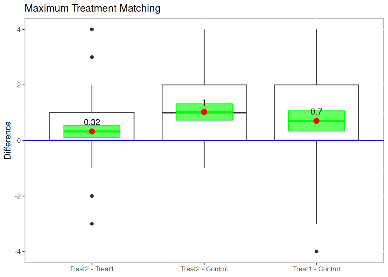
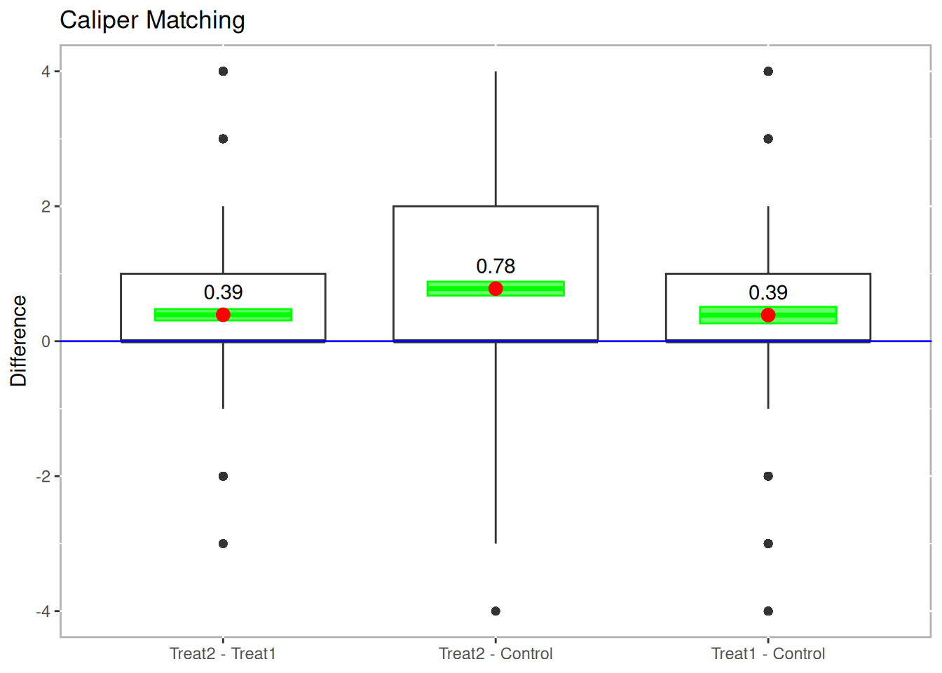
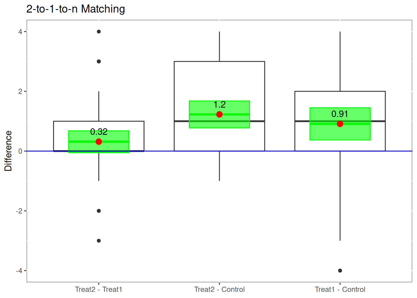
Figure 10.4: Boxplot of Differences
Another useful visualization for presenting the results is the Loess plot. In Figure 10.5 we plot the propensity scores on the x-axis and the outcome (grade in this example) on the y-axis. A Loess regression line is then overlaid.4 Since there are three propensity score scales, the plot.loess3 function will use the propensity scores from the model predicting treatment one from treatment two. Propensity scores for the control group are then imputed by taking the mean of the propensity scores of the two treatment units that control was matched to. It should be noted that if a control unit is matched to two different sets of treatment units, then that control unit will have two propensity scores. Which propensity score scale is utilized can be explicitly specified using the model parameter.
loess3.plot(tutoring.matched.caliper, tutoring$Grade, ylab="Grade",
            points.alpha=.1, method="loess")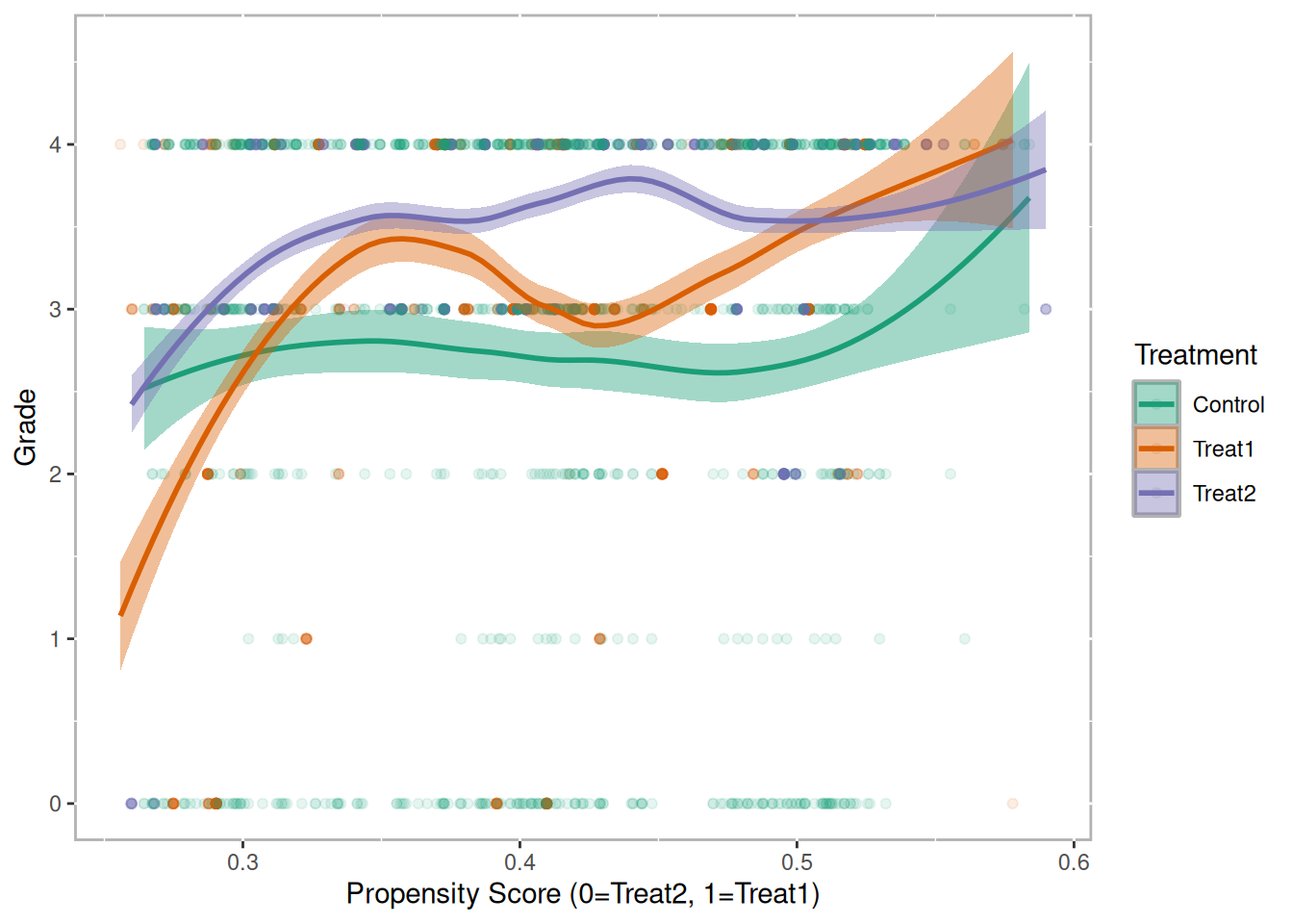
Figure 10.5: Loess Plot for Caliper Matching